Monday, 23 September 2013

Track List and Album Name


When designing my digipak I thought it would be a better idea if I made up new song titles to go for the entire album rather than copying existing titles and rename the album. I chose to name the album 'High' as my video contains many metaphors which could represent this title including the use of pills and 'trippy' mood and the use of skateboarding and gaining 'heights' I decided to adapt this concept from my music video to the digipak. I decided to have the combonation of pills, the couple and the skateboarding within it in order to represent continuity while combining this with the typical conventions I have researched I feel it will make the perfect digipak for my song; Example-Wont Go Quietly.

1. Won't Go Quietly 
2. Sparks
3. High
4. Lovable Rogue
5. Blowing Kisses 
6. Happy Again 
7. Overwhelemed 
8. Scream 
9. Laughter and Stars 

Sunday, 22 September 2013

Digipak forms and conventions


FORMATS:
Digipaks typically consist of a gatefold (book-style) paperboard or card stock outer binding, with one or more plastic trays capable of holding a CD or DVD attached to the inside. As well as this digipaks can represent different formats for example: Hard plastic and soft(just use of card) Tube for packaging, Stick on leaflet etc

CONVENTIONS:

The front of the digipak

The front of digipaks are usually filled with the artist. This is to promote the star to sell the record and for the audience to feel connected with the song and the star.  A lot of the time the artists on the front of digipaks are presented  to grab the audience's eye. As well as this it contains the album name and artist, which is conventional!


Back of the digipak.

Usually in most digipaks they consist of the album tracks (tracklist) and bar code which has the digipak theme running through. The lettering of the tracks fits  in with the genre. The production company logo,copyright symbol are provided as well as sometimes showing contact information such as the email. 


Side of the digipak

The side picture of the digipak contains the album name and artist as well as the reference number a 7 digit code for example FOJ002.


Cd compartment

The CD compartment also continues the theme . The black back drop is really effective.This cover will behind the CD holder, the CD holder is common in digipaks as it keeps the Cd secure, and yet is still lightweight. The CD's themselves usually carry on with the theme although this compartment doesn't follow many conventions, in fact this part is down to preference.


More on Digipak Research:


A type of digipak format and layout
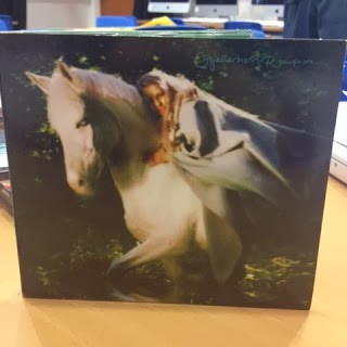
Green Writing on green background, eg A bad convention

A place for the leaflet


Why are they increasingly popular?
Digipaks are the more economically friendly method of CD packaging today, a feature which makes them all the more appealing to the modern consumer. It is easier to produce and ship due to its size and material and is overall more creatively designed and has a more personal feel.

What genres of music do not seem to favour them?
Genres like heavy metal do not seem to favour them very often due to them looking rather quaint and homemade and this not fitting with the style of the musical genre and would not resonate with the target audience. Also, classical music seems to rarely use them and this is probably due to them not needing to spend as much on CD packaging production.


Saturday, 21 September 2013

Digipak Research

What is a digipak?

-A digipak is a type of packaging for CD's typically made from cardboard possibly with an internal plastic holder.


Digipak

 Jewel Case 

What are the pros and cons of digipaks?

PROS:
-more enviromentally friendly
-more artistically created, and design capability 
-cheaper to produce, can be mass printed and folded, easily produced 
-do not crack and break easy like jewel cases 
-can be recycled 
-last longer
-easy to ship, when ordered online
-thinner and lighter-easily stored
-reflects the look of old record packaging 
-allows the artist to make promotion more consitant through continuity representation between digipaks tour adverts web pages etc
-can be recycled due to being made from recycled card and pressed paper

CONS:
-can be damaged by water or tear easily
-a jewel case can be replaced if broken, a digipak can't
-the packaging in some cases makes it harder to remove the disk from it
-less information can be provided in some cases
-they are harder to design as the design has to flow

Genres such as pop, classical and heavy metal ae all genres that doesn't favour the use of digipaks due to it not fitting the visual style of them unlike how the 'indie' genre does. Although after researching I discovered some artists within the genres that don't favour digipaks sometimes produce both jewel cases and digipaks for their album in order to give their audience choice.


Digipak


Friday, 20 September 2013

Justification of Track

I have previously watched the current official video for the track I have chosen- Example, Won't Go Quietly and I thought it didn't represent the artist or the artist image as positively as other songs by him. I also decided I wanted to create a track that co insides with his other videos and has a clear narrative, unlike the current video. The ubeatness of the track allows me to do this. 

Current Wont Go Quietly music video is based on his live preformance, completely different to his usual videos, something I didnt enjoy and wanted to change.


Watch The Sun Come Up Video, is more my style and something I'd like to base the visual style of my music video on


Again the couple being apparent is something I want to take on board as well as the colour of the overlay being quite old school and like an instagram filter- a feature I like and will adapt to my video.

Thursday, 19 September 2013

Visual Style

I had a clear visual style in mind after watching a number of Example's videos including 'Won't Go Quietly' The Track I chose, although after watching this video I wasn't happy with the way it was presented in comparason to his other videos. I found it very comercial although I felt because of this I could combine the style from his other videos to create a better video to coinside with the song without  telling a story but having a clear narrative. Homing in on two characters - a couple is something I wanted to do in order to keep the plot simple but complicate the narrative by not having a clear flowing story. I got inspiration from similar artists of the same genre:


In Katy Perry Teenage Dream there is a clear sense of focus on a couple, and following there doings, which I intend to do in my music video. As well as the colour scheme on here and use of edit on the shot is an effect I would like to take on board 


Rihanna, What's my name video shows locations and shots I would like to include in my music video, the style is something I really liked with the block of flats and the natural lighting creating a hue. As well as this the couple convention is apparent in this video.


I really like the focusing on these to shots and intend to do similar when my actor lip sings.