Researching Example's past album covers was something I wanted to do to see how he represents his own genre. Below I will explain what he has done and how I may bring elements of editing he's used that I can adapt in my own digipak design.
The Evolution of man: Here we can see he has used all lower case letters. the font is simplistic and black as well as the 'Example' being the same style in every album cover to create continuity and cohesion so the font is instantly associated with him and well recognised, although I have researched fonts I hope to now research into finding this font or one similar and recreating the cohesion in my digipak. Overlays of colour sepia effect and a 'old' look to the cover makes it almost look indie, I really like this effect and want to carry it on into my own digipak as I feel this effect creates continuity with my music video overlays.
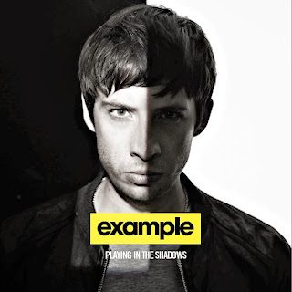
Playing in the shadows: here we see a totally different effect, again it is simplistic and the font is the same but the colour palette reflects differently. I am not going to use this colour palette although the idea of halving a picture is something I would like to bring into my design, I intend to do something similar on my actual disk and the blur of the line is something I would also like to create.
Say Nothing: again here we see the colour palette similar to what I want to create, again the font is the same(continuity) and the front is simplistic, again a characteristic I will take onboard in my designing as it is consistent in examples album covers.
Won't Go Quietly: Overlays and repitition of the font is used once again a montage is an effect I like on this and something I could take on board when designing, again the 'poloroid' photo is used again for the third time, again something I can take on board whilst trying to establish continuity.
Wont Go Quietly 2: Here overlays are used but they have been to brighten the photographs, this contradicts his previous designs, I don't like the colour palette of this and using this colour palette I feel will break the rules of the continuity I am aiming to acheive. Although again the use of montage is something I'd like to take on board and the fact it is structured rather than scattered like the previous one is something I much prefer.


No comments:
Post a Comment