Things I need to sort for my filming day, including props:
Packet of Cigarettes
Car
Lighter
Skateboard
Smirn Off
Pills
Thursday, 31 October 2013
Wednesday, 30 October 2013
Location Planning
1. Block of Flats at night (Dusk)
2. Kerb at night (Dusk)
3. Door-For Slamming
4. Skatepark Rednal (premission asked)
5. Road - For Running down and Zebra Crossing in Gobowen
6. Off Liscence
7.Car- and back of car
8. Alleyway and Police Car
2. Kerb at night (Dusk)
3. Door-For Slamming
4. Skatepark Rednal (premission asked)
5. Road - For Running down and Zebra Crossing in Gobowen
6. Off Liscence
7.Car- and back of car
8. Alleyway and Police Car
Tuesday, 29 October 2013
Digipak Draft initial idea (now changed)
Below you can see my digipak overall plan we can see the continuity from my music video planning, the pills and the use of the same font I discovered after researching a number of my artists previous digipaks.
I also took on board the use of montage for the front cover that I also learnt from Example's.
The colour scheme will also be overlayed to look coloured sepia again looking like a number of the artists's.
Monday, 28 October 2013
Digipak Research
Researching Example's past album covers was something I wanted to do to see how he represents his own genre. Below I will explain what he has done and how I may bring elements of editing he's used that I can adapt in my own digipak design.
The Evolution of man: Here we can see he has used all lower case letters. the font is simplistic and black as well as the 'Example' being the same style in every album cover to create continuity and cohesion so the font is instantly associated with him and well recognised, although I have researched fonts I hope to now research into finding this font or one similar and recreating the cohesion in my digipak. Overlays of colour sepia effect and a 'old' look to the cover makes it almost look indie, I really like this effect and want to carry it on into my own digipak as I feel this effect creates continuity with my music video overlays.
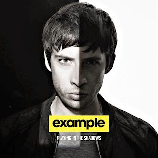
Playing in the shadows: here we see a totally different effect, again it is simplistic and the font is the same but the colour palette reflects differently. I am not going to use this colour palette although the idea of halving a picture is something I would like to bring into my design, I intend to do something similar on my actual disk and the blur of the line is something I would also like to create.
Say Nothing: again here we see the colour palette similar to what I want to create, again the font is the same(continuity) and the front is simplistic, again a characteristic I will take onboard in my designing as it is consistent in examples album covers.
Won't Go Quietly: Overlays and repitition of the font is used once again a montage is an effect I like on this and something I could take on board when designing, again the 'poloroid' photo is used again for the third time, again something I can take on board whilst trying to establish continuity.
Wont Go Quietly 2: Here overlays are used but they have been to brighten the photographs, this contradicts his previous designs, I don't like the colour palette of this and using this colour palette I feel will break the rules of the continuity I am aiming to acheive. Although again the use of montage is something I'd like to take on board and the fact it is structured rather than scattered like the previous one is something I much prefer.
Sunday, 27 October 2013
Digipak, Magazine advert and Webpage Questionaire
I decided a bit more audiece research to allow me to develop the continuity of what else I was going to produce, creating a questionaire allowed me to see other peoples opinions and use them when creating my other pieces.
1. What colours would you associate with the hip hop/pop genre?
2. When thinking about a digipak/cd case what would you expect to see?
3. If you saw a dull and un appealing digipak would you be entrigued to buy the CD? Yes or no?
4. If yes, why?
5. What would you expect to see in a hip hop/pop digi pak?
6. Would you consider buying a CD by a Hip Hop/Pop artist? Yes or no?
7. If no, what would you prefer?
8. Do you think that the Digi Pak, Website and Magazine Advert of the artost would influence you buying the album in any way?
Answers :
Amber:
1. Brighter colours, ones that stand out to for the genre - being quite bold.
2. On the cover I would obviously expect a picture, title of the album and the name of the artist. Then the back having the song titles, barcode and other information about the band. The pictures should relate to the songs within the album.
3. If I hadn't heard of the band then no, I wouldn't even bother looking at it. The albums that catch my eye are usually the ones that I would pick up and have a look at.
4. The overall advertisement should be appealing to audiences and should catch the eye. If it's boring then most likely the artist hasn't put at consideration towards the album cover.
5. The cover usually has a picture of the artist - usually close up. And has a quite plain back. But also at time they look plain overall with a small motif sometimes repeated on the front cover which relates to the songs. Which makes it look quite interesting.
6. Depending of whether or not I like the artist. I don't particularly like the genre as such. But some artists I quite like.
7. I would prefer something that is indie/alternative/folk.
8. Not really. The artist themselves should be appealing to audiences, rater than their distribution and advertising methods.
Saturday, 26 October 2013
Digipak planning
I wanted my digipak to represent continuity of the ideas in my music video therefore reflecting the visual style was essential I will do this by having 'pills' scattered represented on half of the disk and the back of the digipak as a pattern and background. Overlays will change the filter of the photographs making them more old school and almost '90's' the feel I want for the video reflecting the song. I also want to have the legs of the couple from the video within the middle of the digipak stood side by side as a close up shot, to show the relevance of the two of them and showing the enigma within it as well. On the front cover I plan to have it divided into three columns horizontally and have still photography from the 'skateboarding' scene shown here, three different photographs in each section will allow it to look like a movement.
Photography Ideas:
Photography Ideas:
Friday, 25 October 2013
Font Planning
I want my font for my coursework for the production of Example 'Won't Go Quietly' to be very simplistic and I intend to research on 'Da Font.com' in order to find this as I feel creating my own will make to font too Serif. Here are a few I like and narrowed down to five:
UPDATE: Ultimately after my research into examples previous digipak front covers I realised that he hashis own font in order to recreate this I feel Geo Sans Light in bold (white) on a black background would be the closest to what he has on his albums below are experiments:
 |
| Here Is Example's font |
Thursday, 24 October 2013
Requesting Premission
When requesting premission for the use of the track "Won't Go Quietly" I contacted Example's record company-Epic Records owned by Sony Entertainment.
I called the company at first and spoke to someone from the company that gave me an email and details to include in the email. Here is a copies of both emails I sent:
Unfortunately they did not reply.
I called the company at first and spoke to someone from the company that gave me an email and details to include in the email. Here is a copies of both emails I sent:
Unfortunately they did not reply.
Subscribe to:
Comments (Atom)


